Data visualization reveals hidden wonders from telescopes
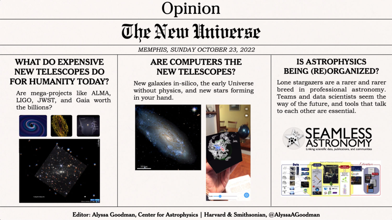
Alyssa Goodman shared her choices of the big questions in astronomy in the form of newspaper-style headlines in her Patrusky Lecture on “The New Universe.” (Image courtesy of Alyssa Goodman.)
Majestic images of the cosmos captivated the world in 2022 following the launch of the James Webb Space Telescope, (JWST). But if you could fly through space, you wouldn’t be able to marvel at those vibrant colors: The Webb telescope measures infrared light, which humans cannot see.
The razzle-dazzle of JWST images we see on TV is created using data visualization — the creation of graphical representations of data. Colors are added to represent the wavelengths of infrared light.
A self-described astronomer who got fed up with visualization, Alyssa Goodman, the Robert Wheeler Willson Professor of Applied Astronomy at Harvard University, led the development of the data visualization software Glue, which was used to bring the JWST data to life for our eyes.
Goodman, an expert in telescope data and displays, delivered the 10th Patrusky Lecture, “The New Universe,” on Oct. 23 during the Council for the Advancement of Science Writing’s New Horizons in Science briefings at the ScienceWriters2022 conference in Memphis, Tenn. A video of the talk is available on YouTube.
Goodman shared a firehose of information on how astronomers are uncovering more of the magnificence of the universe by combining observations, theory, and simulations. Her research program is a web of astrophysics, data visualization, education, and much more.
At their best, visualizations of telescope data can serve many important functions simultaneously: Engage the public with science and technology by spreading awe and excitement, communicate core scientific findings, and facilitate new breakthrough discoveries, Goodman said. But sometimes what is developed falls short.
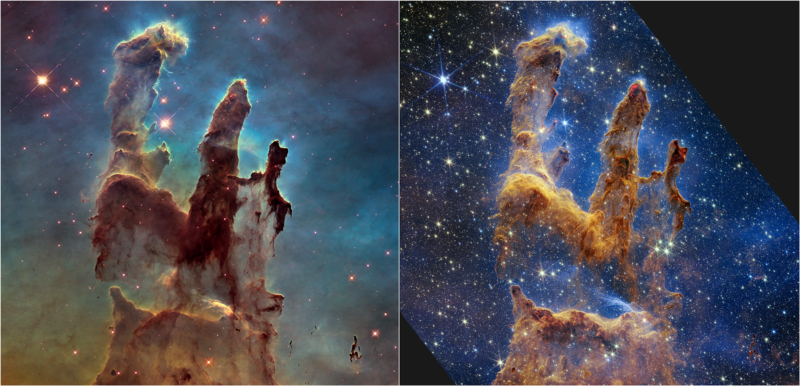
Describing side-by-side versions of the Pillars of Creation image—the original, made in 1995 using Hubble Space Telescope data, and the more refined 2022 version created from JWST data—Goodman said “I just look at them and say ‘wow, that’s really nice.’ But then, when I want to use them or learn something from them, I can get frustrated sometimes.”
Her trained eye sees potential discoveries in these images too—scientific papers flowing out of a wispy swirl or aberrations around a point. She’s dissatisfied when presentations of popular JWST images fail to communicate just what a huge advance in data quality JWST enables over previous telescopes like Hubble.
Leveraging visualization for discovery
That’s where the art of data visualization comes in. For example, Goodman explained that overlaying images from Hubble and JWST and then applying color filters could highlight the contrast between the two and accentuate how much more detailed data are becoming.
Goodman started her career researching interstellar clouds, where stars are formed. Early in this journey, she read The Visual Display of Quantitative Information by Edward Tufte. Inspired, she became a hobbyist in data visualization and created “unusual” graphics compared to her astronomy colleagues — gas and star cartoons communicated telescope observation time in a grant proposal, and a figure of a dust cloud featured an “alien’s” line of sight.
“At first, they wrote back to me like, ‘Are you serious?’ I said, ‘Yeah, I’m serious. People will remember this,’” Goodman said. “I got more and more serious about visualization, but I kept doing astronomy.”
Data visualization enabled a team of astronomers, including Goodman, to discover that star formation occurs on the surface of the Local Bubble, the interstellar cavity within which our sun resides. Their findings were published earlier this year using data from the Gaia space-mapping mission. To this they added three-dimensional visualizations made by Glue. Later they created 3D models of the Local Bubble.
After decades of study in mainly two dimensions, astronomers analyzing 3D data discovered that stars in our Milky Way were born on the surface of the Local Bubble.
In the Zoom recording of this moment of discovery, Goodman and her colleagues, Catherine Zucker and João Alves, are smiling vibrantly. “It was just us messing around with the data, the three-dimensional, and then later making a very detailed physical model.… If you look at that article, you’d think we had this all planned out? We so did not.”
Goodman’s research in astronomy and data visualizations has also contributed to the American Astronomical Society’s WorldWide Telescope, a project that visualizes data from major telescopes. She said the Glue software is valuable for other 2D and 3D data sets, especially when multiple data sets are intricately linked, as in the partnership between Glue and the JWST and biological applications like gene visualization.
Up next, Goodman plans to continue proselytizing the practice of making excellent data visualizations and tools available widely in astronomy, science, journalism, and beyond. Proving that this revolution is achievable, she answered one of the questions in her talk by performing an on-the-fly demo using Glue. She plotted displays of airplane positions over Boston—creating a striking figure in about a minute